
“I’m not afraid to use lively colors” – Thaís Suizo
Coming from Brazil, a country where colors are everywhere, in our nature and our soul, I carry a vibrant palette within me. I believe that when I color an artwork, I am simply allowing a baggage of internalized beauty and light to flow onto the paper.
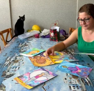
My relationship with colors is very particular: I rarely think about them, unless it’s a prerequisite of the author or something very specific. I let them happen while I’m painting and I simply follow my intuition.
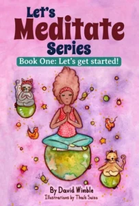 When I was designing the cover for Book One of the Let’s Meditate Series, I told David that I would be working with the color green. Every time I thought about the book cover, the color green came to mind. So I did it. I put the color green all over the background, and what happened was that I didn’t like the result. I don’t think I even got around to showing David that version, because I was determined not to use it.
This usually happens when I’m putting too much pressure on myself. I really wanted the cover to be beautiful and to express David’s entire text for that book as much as possible. What I did next was take a break, and finally, when I decided to return to the cover, everything flowed. I mixed shades of pink, purple, and lilac and just let it happen. I wasn’t thinking about anything, I just mixed everything together.
When I sent the final result to David, I think he was startled, maybe he was expecting the color green. In the end, we agreed that that would be the cover for Book One, and honestly, today I love that artwork.
That experience taught me that my trademark isn’t a specific color, but the vibrant energy that comes when I let go of rational thought.
Today, my process remains deeply intuitive. For Book 3, David is exploring a fascinating concept, deconstructing the predetermined colors of the chakras to break traditional boundaries. To bring this vision to life, I chose to work with yellow, the color of pure light. I’ve used the same shades of yellow for all seven chakras, treating them as manifestations of a single, unified energy.
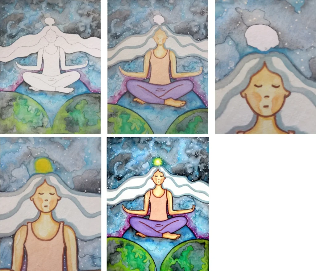
It’s a beautiful challenge, and although I am still deep in the process of illustrating the rest of the book, this yellow path is already teaching me so much.
When I look at my finished illustrations, I often can’t believe I was the one who created them. It shows me that art is about a connection to something bigger, a mix of my Brazilian roots, the colors of nature, and a flow of pure intuition.
That is why I’m not afraid of colors. I have no fear of using whatever color comes to my mind in the moment. If I feel I should use black, I use it. If I feel like mixing everything together, I just do it. I don’t try to control it, I simply let it flow.
I hope you’ll join me on this journey as I continue to paint the light for Book Three. There is so much more to share with you soon.
Warmly, from Brazil, Thaís Suizo